Tokyo Midtown Award 2014 page 15/28

このページは Tokyo Midtown Award 2014 の電子ブックに掲載されている15ページの概要です。
秒後に電子ブックの対象ページへ移動します。
「電子ブックを開く」をクリックすると今すぐ対象ページへ移動します。
概要:
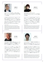
佐藤卓Taku Satoh柴田文江Fumie Shibataグラフィックデザイナー/(株)佐藤卓デザイン事務所代表取締役代表作:「ロッテキシリトールガム」「明治おいしい牛乳」などの商品デザイン、NHK Eテレ「にほんごであそぼ」....
佐藤卓Taku Satoh柴田文江Fumie Shibataグラフィックデザイナー/(株)佐藤卓デザイン事務所代表取締役代表作:「ロッテキシリトールガム」「明治おいしい牛乳」などの商品デザイン、NHK Eテレ「にほんごであそぼ」アートディレクション・「デザインあ」総合指導等プロダクトデザイナー/ Design Studio S代表代表作:無印良品「体にフィットするソファ」、オムロン電子体温計「けんおんくん」、カプセルホテル「9 h(ナインアワーズ)」、JREWB「次世代自販機」日本は様々なものを昔から和えてきた。中国から入ってきた漢字と、その後生まれたひらがなやカタカナを和えてきたし、洋風な料理を様々和えて「洋食」もつくったし、食事の時は箸とフォークナイフの両方がテーブルに並ぶことも少なくない。外部から取り入れて、和えて独自のものに消化をするのが得意な国なのだ。深い意味を持ったテーマに対して、どこまで親しみやすく楽しいものに仕上げられるかが問われた。Graphic DesignerJapanese have mixed all kinds of things. We imported Chinesecharacters and invented the original. We made“Yoshoku”by jumblingtogether Western cuisine with others, and use Japanese and Westerncutlery at the same table. Blending in foreign factors is what we are goodat. This year was about making items that are accessible and fun, based on adeep meaning theme.今年もアイテムとしては多様な作品が集まり、その多くが日本的なモチーフを今の暮しに寄り添うモノに転化させた提案だった。私個人としては、モチーフに留まらず技法や素材の特性を生かしてテーマに展開されたアイデアに面白さを感じた。また例年よりもビジュアル表現やレンダリング表現のレベルが高く、本コンペがデザイン学生をはじめプロのデザイナーの提案の場となりつつあることが見てとれた。Product DesignerWe again saw a wide range of works this year. Many were with a Japanesemotif that can be used in daily life. I was impressed with works that tookadvantage of techniques and materials. The standards of visual expressionand rendering were high, and it was evident that this competition isbeing established for students and professional to make proposals.原研哉Kenya Hara水野学Manabu Mizunoグラフィックデザイナー/武蔵野美術大学教授/日本デザインセンター代表代表作:無印良品アートディレクション、1998年長野冬季オリンピック開・閉会式プログラム、愛知万博プロモーション、松屋銀座リニューアル、森ビルVI、代官山蔦屋書店VI /サイン計画、HOUSE VISIONクリエイティブディレクター/慶應義塾大学特別招聘准教授/ gooddesign company代表代表作:NTTドコモ「iD」、農林水産省CI、東京ミッドタウン、くまモン、中川政七商店、VERY×ブリヂストン自転車「HYDEE」、久原本家(茅乃舎、HiBiNa)「和える」というテーマにまず感心していた。「融合」とか「掛け合わせる」ではなく「和える」。この微妙な日本語のテーマは実にTokyo Midtown Awardらしい。ただし、このデリケートな語感を持つ「和える」の答えを見つけるのは大変だったろう。結果として見事に的のまん中を射たようなアイデアが選ばれた。このアワードもしっかり個性を発揮できるようになった。Graphic DesignerI was intrigued by the theme of this year, which is different from“fusion”or“pairing”. It is a delicately nuanced word and very fitting for this award.However, it must have been hard for the entrants to come up with ideas.The awards went to the entries which were marvelously in line with thetheme. This competition is firmly showing its individuality.人類が経験した変化の時代の中で、産業革命のような大きな変革期を仮に「Big evolution」と呼んでいる。人々は「Bigevolution」が訪れ大きな進歩が生まれると、安土桃山時代やアーツアンドクラフツ運動のように文化を求めてきた。今、インターネットを介したさまざまなネットワークが広がり、人類は再び新たな「Big evolution」の真っ只中にいる。今後一層文化が求められ、デザインの重要性はさらに高まると考えている。Creative DirectorMankind experienced changes throughout history. A big revolution bringshuge advances, and people demand a new culture such as the Azuchi-Momoyama period and the Arts and Crafts movement. Today, the Internethad created networks and mankind is in another big evolution. I assumethat people look for culture, and designs will become more important.13